Featured
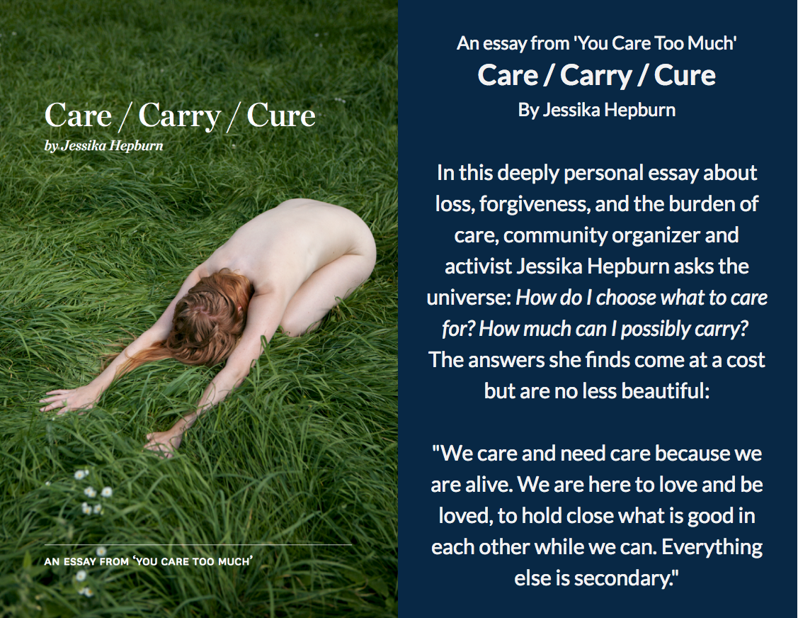
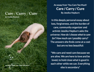
Care/Carry/Cure an essay from ‘You Care Too Much’
In June of 2016 I supported my love Chris as we dealt with the death of both his parents and a co-worker over a three week period. This essay written the summer of those deaths is my attempt to make sense of grief and the struggle to carry all that I care for. Originally published…
Continue Reading Care/Carry/Cure an essay from ‘You Care Too Much’
From the Archives
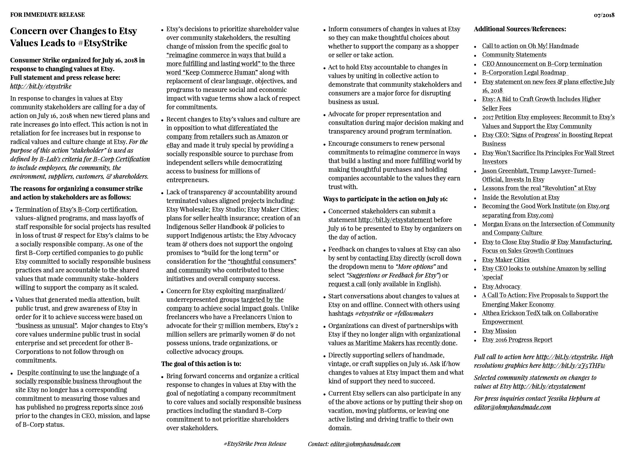
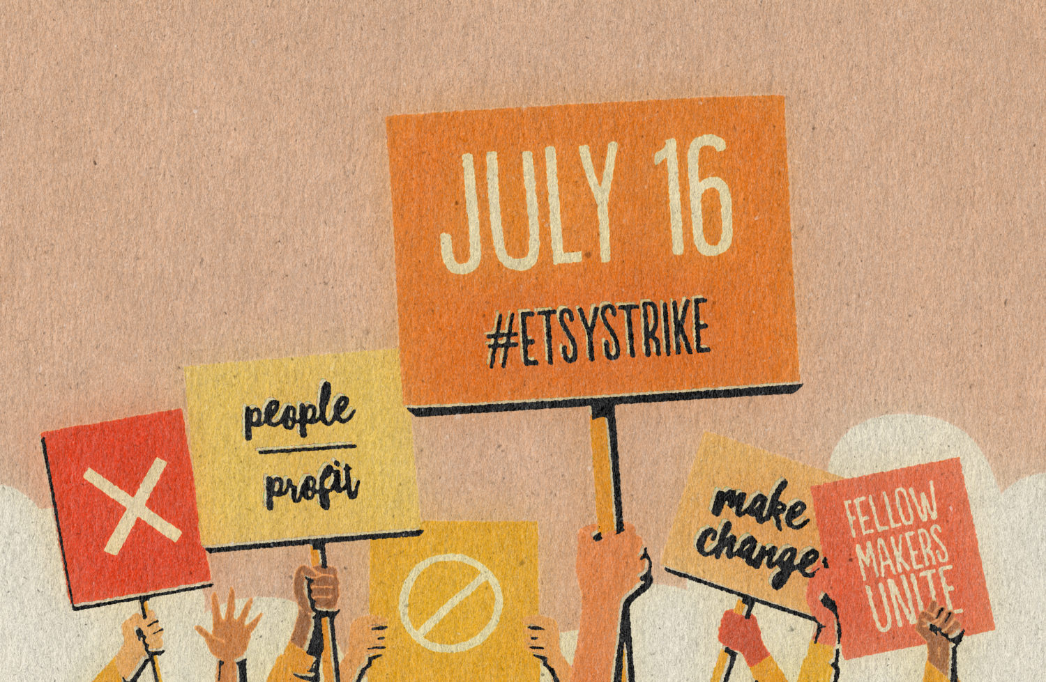
Press Release: Concern over Changes to Etsy Values Leads to #EtsyStrike
For Immediate Release: July 2018 Concern over Changes to Etsy Values Leads to #EtsyStrike Consumer Strike organized for July 16, 2018 in response to changing values at Etsy.…
Continue Reading Press Release: Concern over Changes to Etsy Values Leads to #EtsyStrike
Community Statements on Changes to Values at Etsy #etsystrike
Click to view a spreadsheet of all submissions. View call to action: http://bit.ly/etsystrike IMPORTANT: Letter to Etsy Inc. Board of Directors, July 16 2018 http://bit.ly/lettertoetsy Last month I shared a…
Continue Reading Community Statements on Changes to Values at Etsy #etsystrike
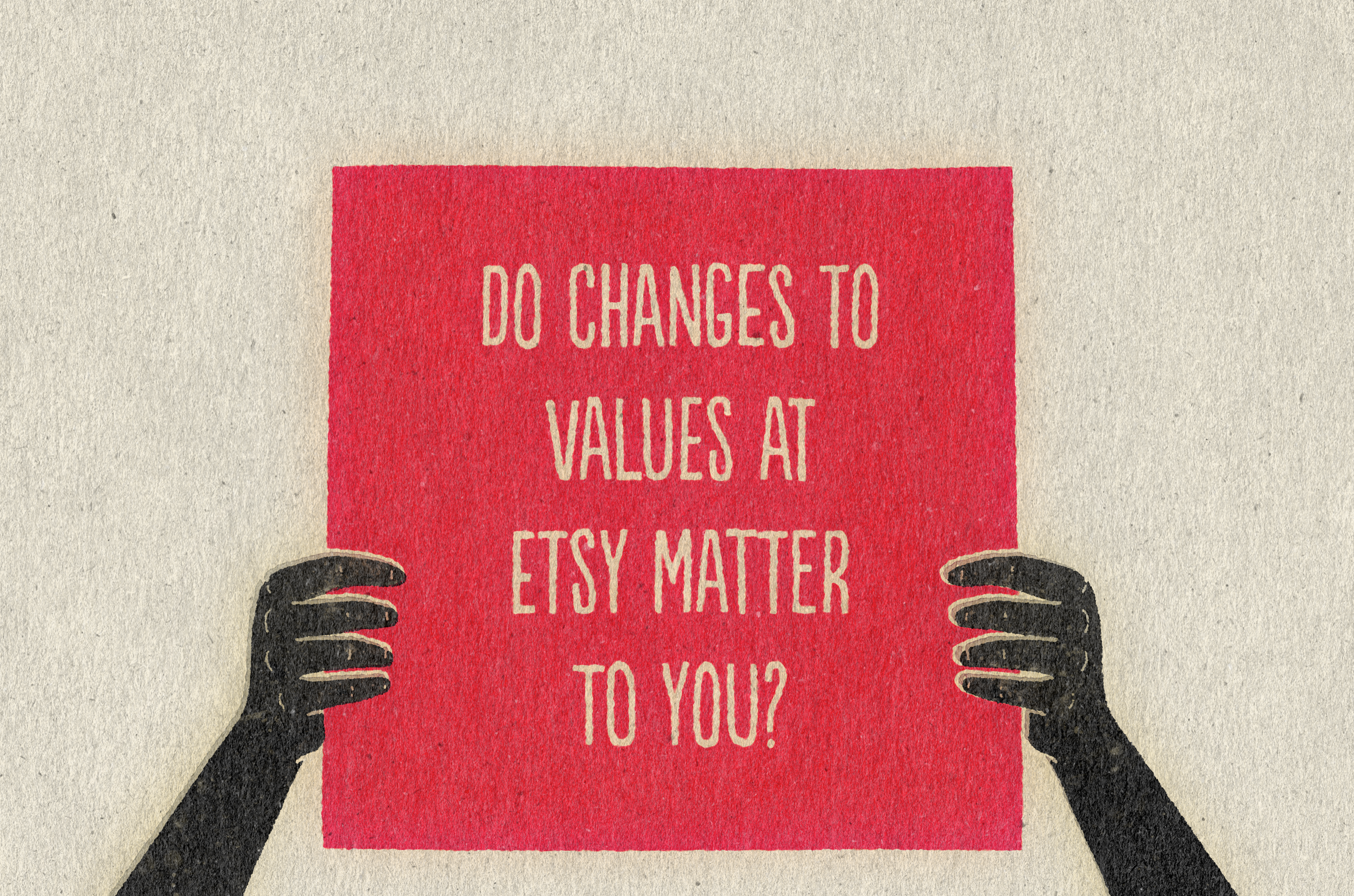
CALL FOR COMMUNITY STATEMENTS: Do changes to values at Etsy matter to you?
Do changes to values at Etsy matter to you? You are invited to share your statement with the #EtsyStrike action either publicly or privately by using the form…
Continue Reading CALL FOR COMMUNITY STATEMENTS: Do changes to values at Etsy matter to you?
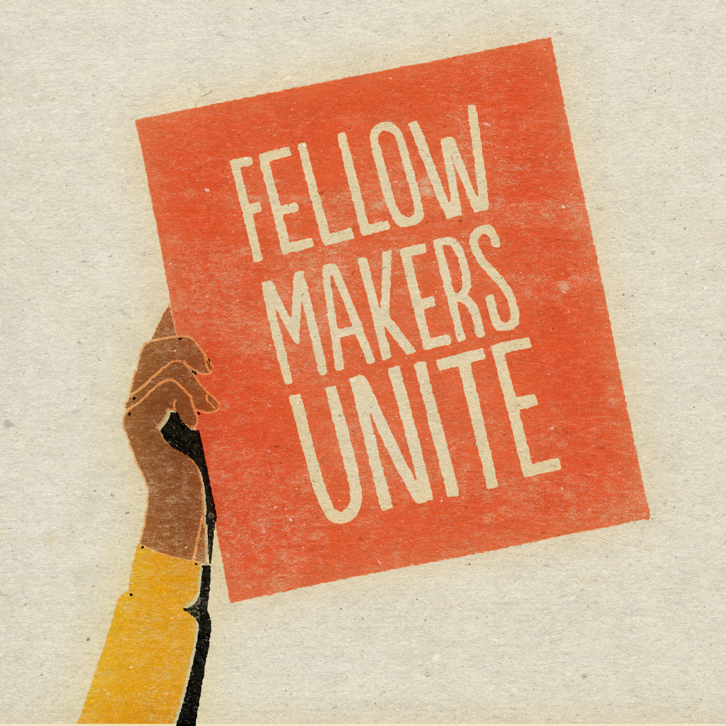
Et Tu, Etsy? A call for fellow makers to strike.
IMPORTANT: Letter to Etsy Inc. Board of Directors, July 16 2018 http://bit.ly/lettertoetsy Dear fellow makers & Etsy sellers I suggest we plan a general strike, For a media version…
Continue Reading Et Tu, Etsy? A call for fellow makers to strike.
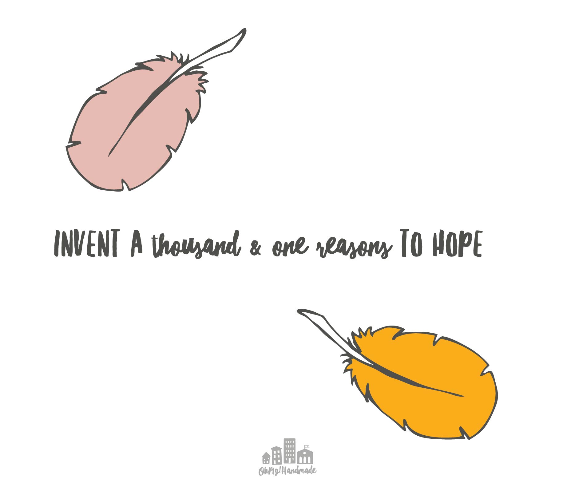
A Thousand and One Reasons to Hope
“Because I remember, I despair. Because I remember, I have the duty to reject despair. I remember the killers, I remember the victims, even as I struggle to…
A New Year’s Revolution
Dear loves & fellow makers, Why don’t we abandon resolutions on the garbage heap of good intentions and commit ourselves to revolutions instead? In the face of fear,…
Explore
Community Statements on Changes to Values at Etsy #etsystrike
Click to view a spreadsheet of all submissions. View call to action: http://bit.ly/etsystrike IMPORTANT: Letter to Etsy Inc. Board of Directors, July 16…
Continue Reading Community Statements on Changes to Values at Etsy #etsystrike
CALL FOR COMMUNITY STATEMENTS: Do changes to values at Etsy matter to you?
Do changes to values at Etsy matter to you? You are invited to share your statement with the #EtsyStrike action either publicly…
Continue Reading CALL FOR COMMUNITY STATEMENTS: Do changes to values at Etsy matter to you?
Et Tu, Etsy? A call for fellow makers to strike.
IMPORTANT: Letter to Etsy Inc. Board of Directors, July 16 2018 http://bit.ly/lettertoetsy Dear fellow makers & Etsy sellers I suggest we plan a…
Continue Reading Et Tu, Etsy? A call for fellow makers to strike.